Fix vertical text alignment in a flex box with CSS text-box-trim
A fixed-height label whose all-caps text looked too high — even though getBoundingClientRect() swore it was centred. Why the box lies, how to measure the actual glyph ink, and the text-box-trim property that finally fixed it.
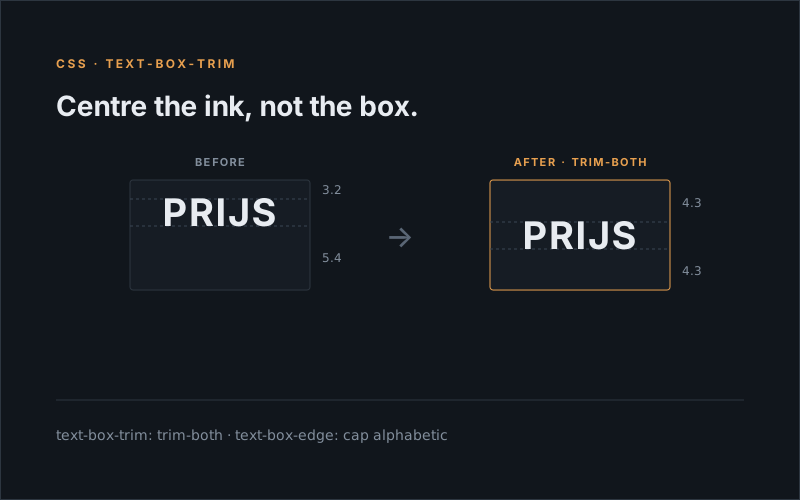
Working on an A/B test for a category page, I had to restyle the little promo labels that sit on each product tile — SCHERPE PRIJS, BESTSELLER, that kind of thing. The design called for a fixed label height of 17px. Easy:
.product-label {
	height: 17px;
	display: flex;
	align-items: center;
	justify-content: center;
	padding: 0 6px;
}
(First go I left padding: 3px 6px on there and the text overflowed. box-sizing: border-box means the 17px includes the padding — 6px of vertical padding leaves an 11px content box for a ~14px line of text. Drop the vertical padding, let flex do the centring. Fine.)
Except it still looked off. The caps sat high — more air under the text than above it. I nudged padding, I poked at line-height, I stared at it. Nothing landed: fix the bottom and the top went wrong.
So I measured it, fully expecting to catch the asymmetry:
const label = document.querySelector('.product-label');
const span  = label.querySelector('span');
const l = label.getBoundingClientRect();
const s = span.getBoundingClientRect();
({ above: s.top - l.top, below: l.bottom - s.bottom });
// → { above: 3, below: 3 }
Three pixels top, three pixels bottom. Perfectly centred. The numbers said I was wrong and my eyes were lying.
My eyes were not lying.
The box is centred. The glyphs are not.
Here’s the thing getBoundingClientRect() won’t tell you: it measures the line box, not the letters. A font’s line box reserves room for descenders — the tails on g, y, p — and for the full ascent. My labels are all-caps. No descenders. So that reserved space at the bottom just sits there, empty, shoving the visible caps upward inside a box that is itself perfectly centred.
To see it, you have to measure the actual ink. Canvas measureText() hands you the real glyph metrics:
const cs  = getComputedStyle(span);
const ctx = document.createElement('canvas').getContext('2d');
ctx.font  = `${cs.fontWeight} ${cs.fontSize} ${cs.fontFamily}`;
const tm  = ctx.measureText(span.textContent);

const range = document.createRange();
range.selectNodeContents(span);
const baseline = range.getBoundingClientRect().top + tm.fontBoundingBoxAscent;

const rect  = label.getBoundingClientRect();
const above = (baseline - tm.actualBoundingBoxAscent) - rect.top;
const below = rect.bottom - (baseline + tm.actualBoundingBoxDescent);
// → above: 3.2, below: 5.4
There it is. 3.2px above the caps, 5.4px below. The box was centred; the text was riding high by more than two pixels. Exactly what I was seeing, and exactly what the bounding box refused to admit.
And this isn’t just my label. It’s the same mismatch behind every standoff with a designer over spacing: they say the Figma reads 24px, you say your CSS is 24px, and you’re both right. Figma trims to the visible glyph; the browser pads to the font’s metrics. Same number, different box.
The fix is one property (that I’d never used)
For most of CSS history there was no clean way to fix this. You’d add a magic-number padding-top, or a transform: translateY(-1px), and tune it by eye until the caps looked right. The catch: that number is glued to one specific font’s metrics. The moment the production brand font differs from the fallback you tested with, your careful nudge is wrong again. Centred on my machine.
Then I found text-box-trim. It trims the line box down to the cap height and the baseline, so the empty ascent and descent stop counting — and then flex centres the actual letters:
.product-label > span {
	text-box-trim: trim-both;
	text-box-edge: cap alphabetic;
}
Measure again: 4.3px above, 4.3px below. Done. And because it derives from whatever font is actually rendering, it stays correct when the brand font loads in production — no magic number to break.
Those two longhands also fold into the text-box shorthand, if you prefer a single line — trim-both for the trim, cap alphabetic for the edges:
.product-label > span {
	text-box: trim-both cap alphabetic;
}
One gotcha cost me a minute: it has to go on the element that generates the line box. My label is a flex container with the text in a child <span>, and putting text-box-trim on the label did exactly nothing — same 3.2 / 5.4. On the span it snapped into place. The line box belongs to the text node, so that’s where you trim.
The fixed 17px height was only my design spec, not something the property needs. The real trigger is just the box being taller than the text’s ink — and padding does that to almost every badge, pill, and button out there, no fixed height in sight. Same caps-riding-high asymmetry, same one-line fix:
<span class="badge">BESTSELLER</span>.badge {
display: inline-block;
padding: 6px 10px;
font: 700 12px/1.2 system-ui, sans-serif;
color: #fff;
background: #1463ff;
border-radius: 4px;
}
/* Comment this out: the bottom padding looks fatter than the top.
Add it back: both paddings hug the caps. */
.badge {
text-box: trim-both cap alphabetic;
}I measured this one the same way. Without the trim, the gap under the caps comes out fatter than the gap above — the font’s empty descent padding the bottom out. Add it back and they match, and the badge gets shorter: the reclaimed ascent and descent are gone, so your 6px finally means 6px of space around the actual letters instead of around the line box.
Note the text-box sits on .badge itself here, not a child. With inline-block the text lives directly in the badge, so that’s the box holding the line — the child-span gotcha above only bites when a flex or grid container pushes the text out into its own item.
text-box-trim, text-box-edge, and the shorthand have been in stable Chrome since early 2025 and Safari since 18.2, so on a modern audience you’re fine. Feature-detect if you’re nervous — CSS.supports('text-box-trim', 'trim-both') — and keep the flex centring underneath as the fallback. Unsupported browsers just get the slightly-high line-box version, which is what everyone shipped for twenty years anyway.
The real lesson isn’t the property, though. It’s this: when something looks wrong but your measurements insist it’s right, check what you’re measuring. The box was never the thing. The ink was.
Happy debugging 🔍